

Drenched in Blue: Color Drenching and British Heritage Interior Design
Blue has long been the most beloved color in interior design—associated with calm, confidence, and timeless elegance. From Mediterranean coastlines to classic British country homes, blue interiors create spaces that feel both grounded and transportive. In this Prince of Scots design meditation, we explore the art of color drenching with blue, blending heritage textiles, natural light, and layered tones to create a space that feels effortlessly luxurious.

The Power of Blue in Interior Design
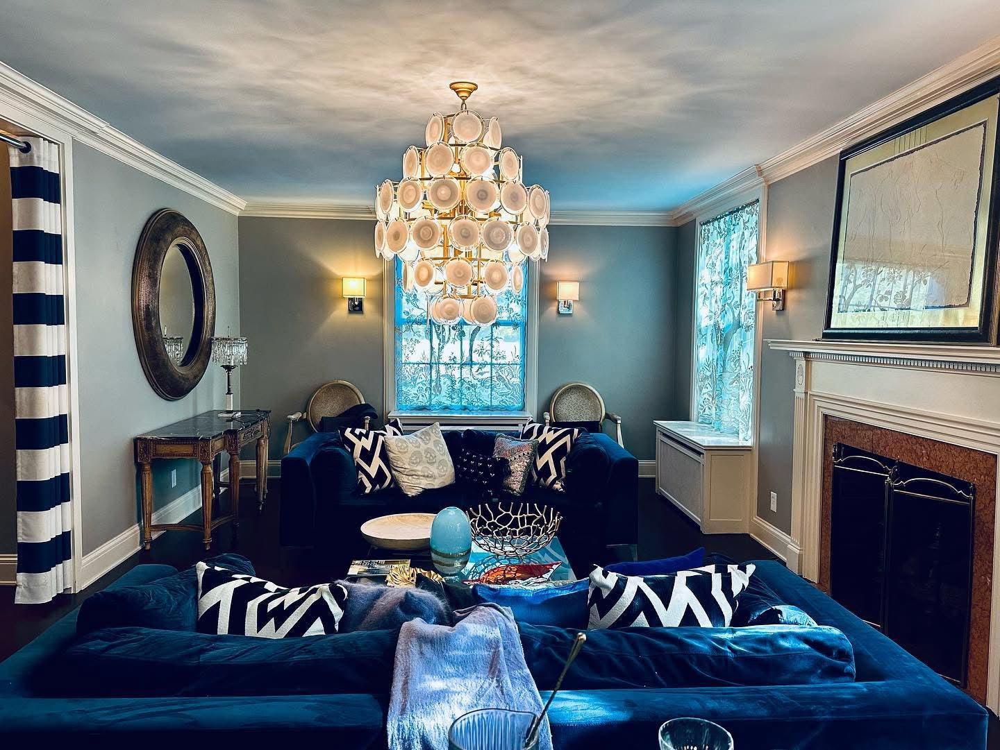
Inside this salon, layers of deep indigo, soft periwinkle, and whispering haint blue saturate the space with quiet drama. From velvet seating and graphic pillows to the luminous ceiling above, every element contributes to a tonal symphony. The result is immersive, modern, and calming—a minimalist's take on maximalism.
At the heart of the room are our Paradiso window coverings, custom made in Scotland. These textile panels are more than functional—they are art. Their botanical pattern, rendered in pale turquoise, moss, and porcelain blue, filters light like a watercolor in motion.
British Heritage and the Language of Blue
Blue has long played a significant role in British design traditions. From historic country houses to coastal cottages overlooking the Channel, blue tones have been woven into the language of British interiors for generations.
Traditional textiles often incorporated indigo, navy, and muted sky tones—colors that reflected both natural landscapes and practical dye traditions. These hues were commonly found in tartans, woven wool blankets, upholstery fabrics, and decorative trims.
The enduring appeal of these shades lies in their subtle sophistication. British design rarely relies on excess or spectacle. Instead, it celebrates craftsmanship, balance, and restraint.
Blue embodies that philosophy perfectly.
Within heritage textiles, blue often acts as a grounding element, harmonizing stronger colors such as reds, greens, and golds. It provides contrast without harshness and elegance without ostentation.
For Prince of Scots, this heritage remains central to our design perspective. Our textiles draw inspiration from traditional weaving traditions while presenting them through a modern lens—honoring the past while shaping contemporary interiors.
![Premium Sheer Panels: The Springtime-Home Gifts-[bar code]-Prince of Scots](https://cdn.shopify.com/s/files/1/1008/9820/files/Premium-Sheer-Panels-The-Springtime-Home-Gifts-5.png?v=1772566431)
Blue Space and the Art of Stillness
This room channels the psychological phenomenon of blue space—the unique calm we feel near bodies of water. Scientific studies link the color blue to lower stress levels and increased mental clarity, which is why oceanfront views and lakeside moments feel so restorative.
Without ever stepping outside, this space recreates that effect through carefully chosen materials and mindful design. From the glint of hand-cut glass on the bar cart to the softness of wool throws draped across the sofas, each element echoes the hush of an early morning tide or a beach walk at dusk.
Designing a Room Around Blue Textiles
Textiles are often the easiest and most effective way to introduce color into a room, and blue textiles offer remarkable flexibility. A well-chosen wool throw, patterned curtain panel, or woven tartan can instantly establish the visual tone of a space.
Rather than beginning with paint or furniture, many designers start with textiles to define a palette. A richly woven throw draped across a chair or sofa can guide the selection of complementary colors throughout the room.
Blue textiles also interact beautifully with natural light. As sunlight shifts throughout the day, the color reveals different moods—cool and crisp in the morning, deeper and more contemplative in the evening.
Layering different shades of blue can create visual depth while maintaining harmony. Pairing a navy wool throw with lighter textiles, neutral upholstery, and warm wood tones creates a balanced environment that feels both inviting and sophisticated.
In this way, textiles become not only decorative accents but the foundation of the room’s design story.

Southern Roots, Elevated Design
No detail here is accidental. The ceiling is painted haint blue, a beloved tradition in Southern architecture, dating back to the Gullah Geechee communities of the Lowcountry who believed the hue warded off restless spirits.
On the walls hang six framed artworks that, upon closer inspection, are not paintings at all—but the original blueprints of the home, built in 1926 and listed on the National Historic Register. A reverent nod to history, they ground the room in place and memory, anchoring the modernity in legacy.
This is a design that celebrates craftsmanship, heritage, and mindfulness. Rooted in history. Immersed in color. And ready to inspire.
“A room drenched in blue feels both calm and confident. It’s the color of sky, sea, and tradition—timeless, layered, and deeply comforting.” ~ David Campana, Prince of Scots Chief Creative Officer.
Quiet Luxury and the Return of Timeless Interiors
In recent years, the design world has embraced what many describe as quiet luxury—interiors that favor craftsmanship, heritage materials, and enduring style over fleeting trends. Rather than bold statements or excessive ornament, quiet luxury celebrates subtle refinement.
Blue interiors naturally reflect this philosophy. Deep navy tones, heritage tartans, and softly woven wool textiles create spaces that feel grounded, elegant, and authentic.
Within this movement, designers are rediscovering the beauty of natural fibers and traditional craftsmanship. A finely woven wool throw or bespoke textile becomes more than decoration—it becomes part of the architecture of the room.
At Prince of Scots, this approach to design has always been central to our philosophy. Our textiles are created to bring warmth, texture, and heritage character into interiors that value timeless beauty over passing fashion.
![Southampton Home Merino Wool Herringbone Throw (Classic Navy)-Throws and Blankets-[bar code]-Prince of Scots](https://cdn.shopify.com/s/files/1/1008/9820/files/Southampton-Home-Merino-Wool-Herringbone-Throw-Classic-Navy-Throws-and-Blankets-2.png?v=1769974594)
Creating a Calm Luxury Interior
In recent years, designers have increasingly embraced the concept of quiet luxury—spaces that prioritize quality materials, subtle detail, and timeless aesthetics over bold statements or fleeting trends.
Blue interiors embody this philosophy naturally.
Unlike louder colors that demand attention, blue creates a sense of calm confidence. It encourages relaxation while maintaining elegance, making it particularly well suited for living rooms, bedrooms, and reading spaces.
A calm luxury interior often relies on a thoughtful mix of textures: soft wool, polished wood, linen upholstery, and carefully chosen metals. When these elements are layered together within a cohesive palette, the result feels effortless yet deeply considered.
Lighting also plays a role. Soft natural light enhances the depth of blue tones, while warm evening lighting creates a gentle contrast that highlights the richness of the materials.
In such environments, luxury is not defined by excess but by the quiet pleasure of living with beautiful, well-made objects.
The Prince of Scots Approach to Heritage Color
At Prince of Scots, color is never chosen casually. Each palette emerges from a deep respect for textile tradition combined with a contemporary understanding of how people live today.
Our design process begins with heritage—classic tartans, traditional wool weaving, and the enduring color relationships found within historic textiles. These elements provide the foundation from which new interpretations are developed.
Blue frequently appears within our collections because it reflects the balance we strive to achieve: classic yet modern, refined yet approachable.
A Prince of Scots throw is designed to do more than provide warmth. It serves as a visual anchor within the home—a piece that connects craftsmanship, comfort, and personal style.
When placed within a thoughtfully designed room, these textiles help create spaces that feel layered with history while remaining unmistakably contemporary.
In the end, heritage color is not simply about tradition. It is about continuity—bringing the beauty of the past forward into the way we live today.
Frequently Asked Questions About Blue Interiors
Why is blue popular in interior design?
Blue is widely associated with calmness, harmony, and confidence. Designers often use it because it works with both traditional and modern interiors.
What is color drenching in interior design?
Color drenching is a design technique where a single color palette is layered across walls, textiles, and furniture to create a cohesive immersive space.
What colors pair best with blue interiors?
Blue pairs beautifully with crisp white, warm wood tones, brass accents, and heritage textiles like tartan or wool throws.
How can textiles add blue to a room?
Throws, window coverings, and cushions are the easiest way to introduce blue tones while maintaining a flexible design palette.
Why Designers Love Blue Interiors
Interior designers often return to blue because it offers extraordinary versatility. Blue works effortlessly across traditional, coastal, modern, and heritage-inspired interiors. It pairs well with natural materials, complements both warm and cool palettes, and provides a calming visual foundation for layered textures and patterns.
For homeowners seeking a timeless interior style, blue remains one of the most reliable and elegant design choices.